After watching Pixar’s excellent new movie Turning Red, I decided to try my hand at drawing Mei Lee, the main character, to use on Discord as a profile icon. As you can see above, I got some decent results (there’s still a good bit more to do, though!). I learnt quite a bit in the process of drawing this one piece, and I thought it might be useful to other starting artists to describe some of the issues I encountered, and show how art can progress.
Let’s start with the initial sketch, shall we?

As you can see, the sketch is quite a bit different to the latest draft drawing. In my opinion, a good sketch is just a few minute “this is vaguely what I want the piece to look like” thing. It should note any notable pose features, facial expressions, etc. but it shouldn’t be very detailed. As long as you can understand the important things you want to have, it’s a good sketch! Some of your favourite media probably started with quick drawings and/or writing on a napkin or other random pieces of paper.
I then take my sketch, and attempt to make the linework a little better. This is on top of my sketch, so I can refer to it as need be. You can make different tabs of the same file in Illustrator (I’ll come back to this again later, for a different use) which can see different sets of layers. You can also just simply leave the sketch layer visible under the new draft layer in the same tab. This is a neat little trick I learnt while doing this piece!

Multiple tabs of your art piece, how useful!

My initial draft
You can see the character has a bit more definition now, it looks a lot more like a real character already. I was trying to for a leaning look for her, and you’ll see this come into effect more later, which is why her hair is so far to the side.
Since this is Illustrator and I can edit the lines directly as I go (vector art is really cool if your hand coordination isn’t so good), I don’t worry too much about making straight, perfect lines. If you aren’t familiar, in vector art, lines are defined with a number of “anchors” along the line which define how the line should bend from that anchor to the next ones along the line.

That tangent aside, let’s continue through my drawing!

Got some facial features going
You can notice the hand is gone, I decided that I did not feel like figuring out how to draw hands. Hands are pretty hard! A lot of character artists skip on drawing a finger and only give their character 3 fingers and a thumb. I will eventually learn to draw hands well, but I just wanted a cute and quick icon (I showed myself wrong, a week later and it’s still not done).
I also gave her some facial features now. If you’ve noticed between the two drafts, the ears are much lower this time. I am not used to drawing characters with glasses, so I didn’t particularly notice the problem that heavily before. I’m used to drawing ears on the same exact vertical space as the eyes, but that’s not where they go.
Some people do some tricks to proportion the face right and get everything in the right place, but I never learnt to do any of that. I haven’t gotten any real formal art training, and I probably should learn these things. I’m getting better at it regardless though!
Lastly, you can notice I rotated the canvas a bit to make the character be upright, so that I can see what I’m doing better with aligning all the facial features. In Illustrator, you can use Shift+H, then click and drag to rotate the canvas, which is another helpful trick I learnt. I previously used Illustrator on a Surface Pro, where I could just physically rotate the tablet.

Hair clip and sweater
In my next iteration of the drawing, I drew her hair clip, the sweater details, and separated her arms from her body a little. I got some advice from some of my friends on the previous version of my linework and went through them on this one, playing with things to see what I can do.
I find that bouncing my art off other people who give friendly advice can help advance my art faster, and help me figure out problems quicker. It also helps iternalise your learnings if you repeatedly write down everything that you learn – such as me writing what you’re reading right now. It is at this point that I decided to put the drawing down and head to bed for the first night.
I also rotated her body to be straight up, with her head leaning instead of her whole body.
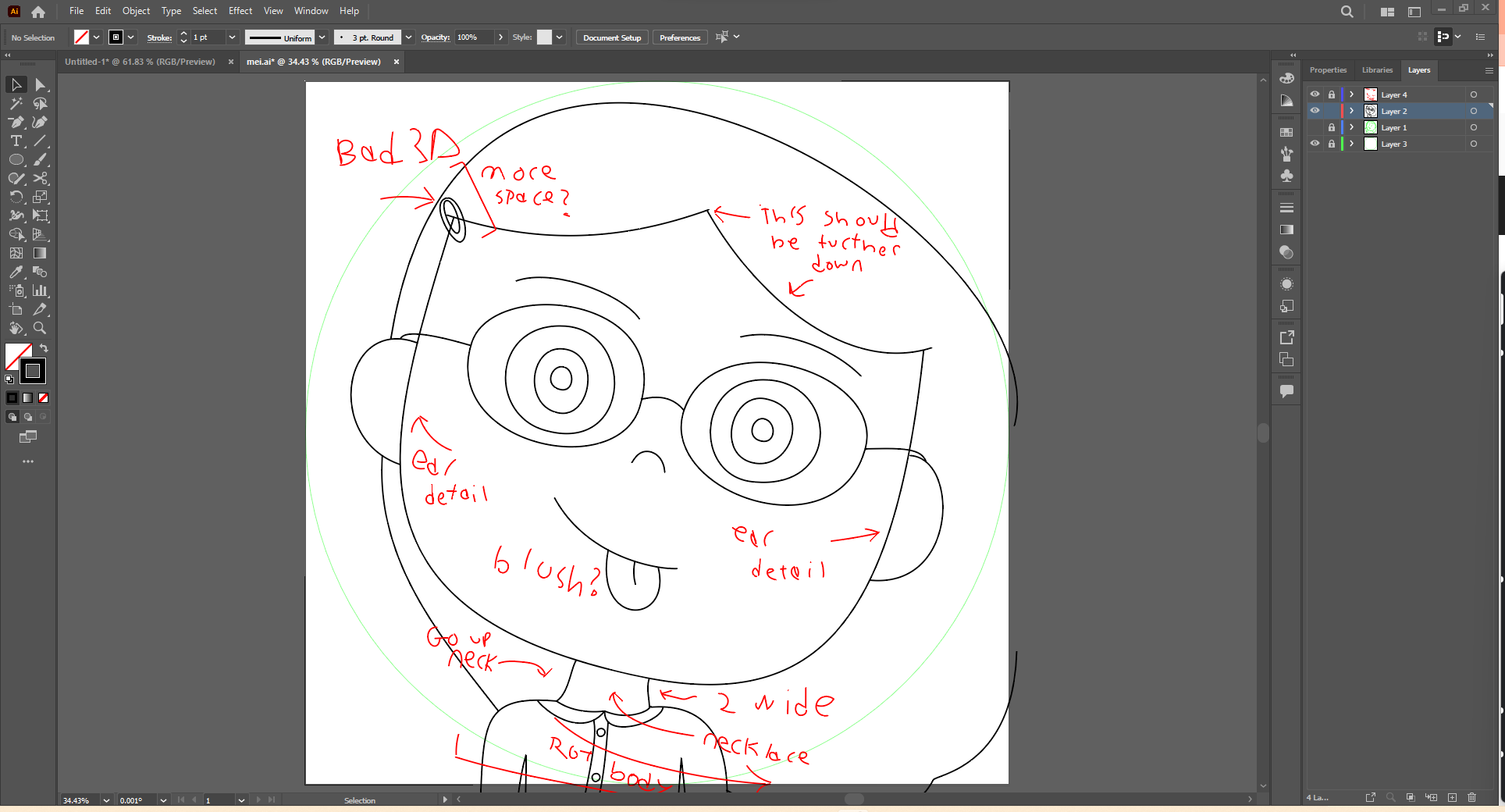
My notes for my draft
When I put my drawing down for an extended period of time, I like to create a notes layer to remind myself of all the things I was working on or noticed when I come back to it. You can see in further detail what I already knew about this art piece here.

Wider body
The first thing I decided to do the next day was to make her hair look more like it should, falling down rotated a little, instead of looking like its blown to the side. It doesn’t quite look that great here, though. Some of these edits require a few passes to get good.
On to the next problem, for now… her body looks quite skinny. I made it a bit wider, so that it looks better proportioned.

Earings, and ear line style 1
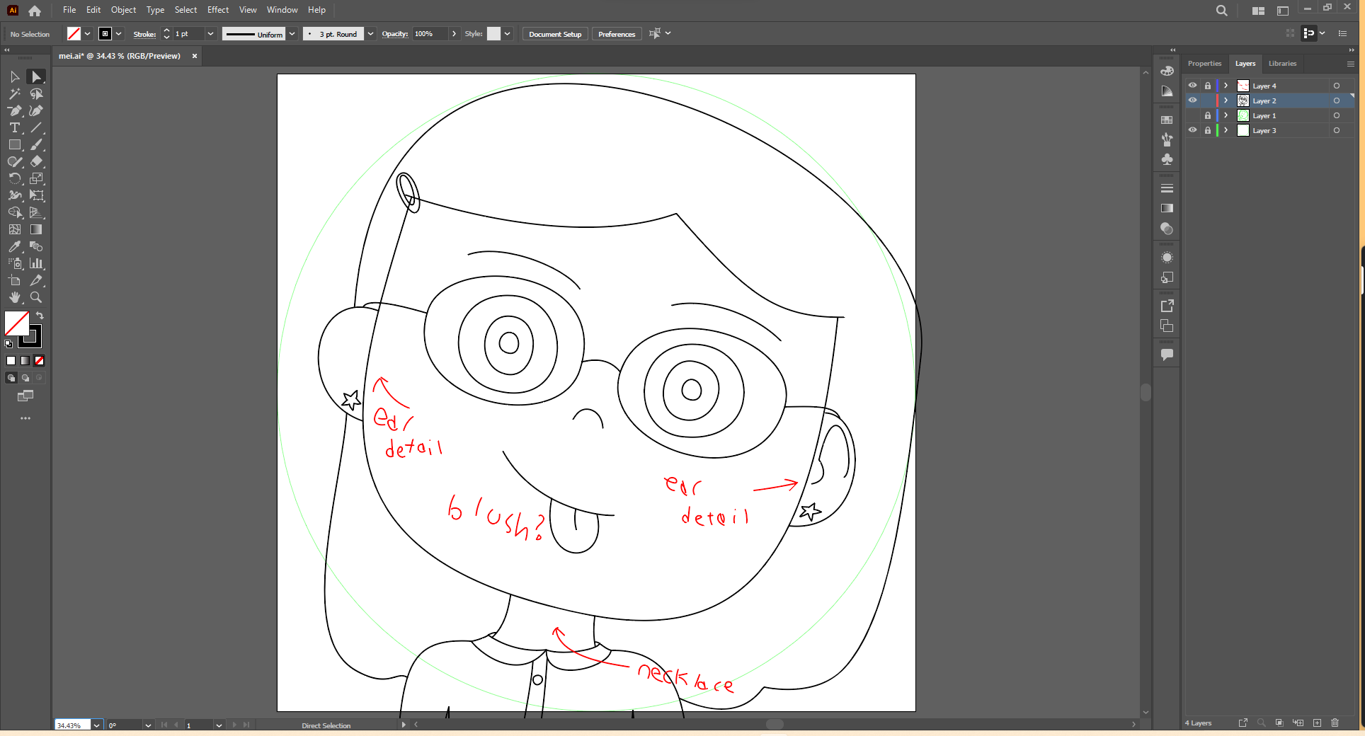
Ear line style 2
I couldn’t quite decide how to draw her ear lines, ears are a consistent problem for me. I spent a good bit of time collaborating with my girlfriend on how to best do it, but I settled on style 1 for now. I also got her star earrings drawn, perhaps a bit crudely though.
You can also tell at this point that I made the collar 3D. This is another thing that is new for my art. Characters necks and arms are not always perfectly connected to the edges of their clothing, and this gives them a bit of depth.

Making a curved necklace
I also attempted to draw some guides for drawing Mei’s necklace, but I ultimately decided against drawing it. It would not look good at a small size, like a profile picture, and she doesn’t always wear it. Making curved guidelines is another thing that should’ve been obvious, but I learnt to do here, so I figured this was worth an honourable mention.

Coloured drawing
I flat coloured the drawing, thinking it was done… however, it looked quite bad at the small sizes I wanted (the first, smallest one is Discord profile icon sized).

Remember earlier when I said you can make multiple tabs in Illustrator with the same art piece? Here is where I learned about it, and the other use I mentioned. I can make a second tab of the drawing, and split the tab off into its own window to put on my second monitor.

Much smaller view of the art
Look at that, now I can live view my icon at a smaller size while I edit the large version on my primary monitor! Pretty nifty. They both update at the same time, too. This combines with the two different windows being able to see different sets of layers, if you like.

Some line work edits
At this point, it’s back to the drawing board (heh, get it??). I edited the thickness of some lines, and made the glasses lines silver so they “disappear” a bit at smaller sizes, making the small size less busy. This is where I left off, but I need to work on it a good bit more to make it finished.

Hopefully, you’ll be seeing more of this art piece pretty soon!